BitmapFont
Pixel art fonts (also known as bitmap fonts) are made-up of square pixels on a grid.
PiZmono.woff2
The font that this website uses. I designed it in an afternoon using BitFontMaker2. Kouzeru introduced me to it.
The goal was to design a font that uses as least no. of pixel as possible, while allowing to display all of the english alphabet, numbers and symbols in the ASCII character set.
The design of the english alphabet is such that the letters fit in a grid.
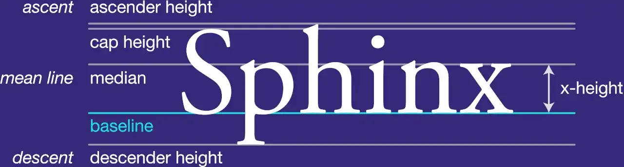
Notice how the x-height is slightly less the sum of the ascender and descender height. My font uses a 2:1 aspect ratio with 5 pixel width. A long time ago, when I was first introduced to bitmap fonts, I had designed a font which was used in my Scratch operating system project, and that uses 5 pixels for each of these three distances for even more symmetry. I choose these dimensions because they make uppercase N, K and a few other letters look better.
The period, comma and semi-colons use 2x2 dots, but they cannot be centered on our 5-width canvas, I prefer them towards the left side. This makes periods at the end of the sentence be closer to the word they belong to, as you would usually put a space after them anyways. We can't do the same for the exlaimation mark, as the stem needs to be 1px thick. So, that has to use a 1x1 dot. Most fonts have the asterisk symbol aligned to the top, but I like to have it centered as its used as the multiplication operator in programming.
The font was converted from .ttf to .woff2 to be 34.5% smaller.